

I wanted to make a post that showed all the different card layout ideas and iterations. Not only might this help you learn from my mistakes, but I also just wanted to have all the ideas in one location, because I’m actually still tweaking. So consider this like a little museum.

original design
The original card design from 2009 was based on an entirely different set of mechanics and rules. I talk about that game in this blog post. The game needed to be scrapped altogether. That card was designed by a different artist (I do not even remember who).
first new iterations
The original card (Dark Ogre, purple) designed by me. I was just brainstorming some general look and feel. As you can see I wanted the beveled look. The attack and move directions were at the top. In the second variation (Truth, purple), I changed that to be the compass icon in the center, which I really loved. But I wasn’t satisfied with the look of the card.
new card layout
In the next iteration, I redesigned the whole card. You can see the first Genther Stormloft design (AI placeholder art). The banner was on the right. I kept the compass idea, and all the stats were in the center. This proved to be too small to read.
bigger compass, new stats
In the next iteration, I made the compass icon way bigger. You can see this in the Grand Inquisitor card (AI placeholder art). This was the previous movement/attack direction style, though, which needed to be changed to allow for a minimum of 3 directions each way. The bottom half of the card was also updated to give more space for text.
new banner style
The next iteration (Genther Stormloft again), I moved the banner to the left side. This is because when the cards are fanned out in your hand, you see everything on the left, so it needed to be visible. This is also the first variation with the new attack/move compass style. This design had lots of legibility issues, though, so I did a complete overhaul.
clean design
The complete redesign featured a clean layout. (Oakfoot Troll, orange). It was very legible. This card proved to be the easiest design yet to read.
clean design, stylized
I wanted to match the clean look with the back of the card, so I stylized it with the same bevel as the logo on the back (Maucus, orange). I added the textures, too. I loved this look, but it was also not very legible on the printed cards. Boo.
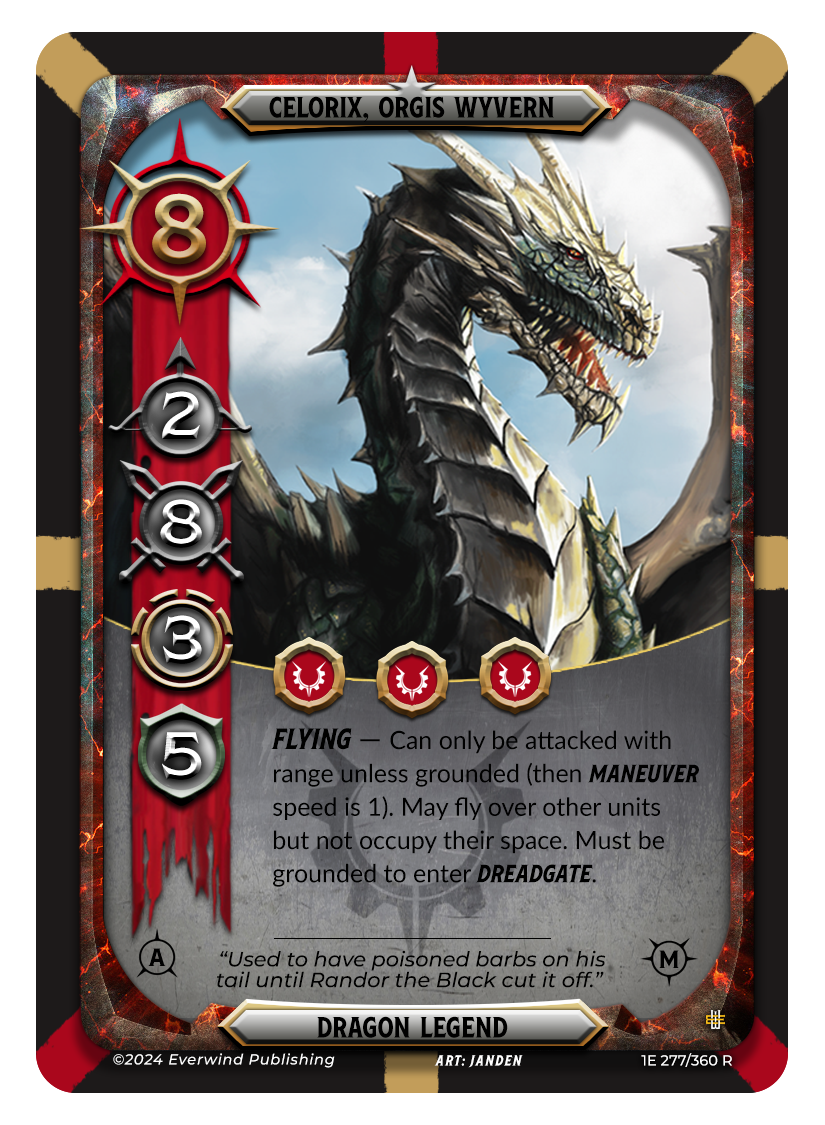
return to the old style
While the clean design was the most legible, people preferred the look of the old style. It matched the fantasy vibe more, so I switched back and made some updates. Enter Celorix, Orgis Wyvern (red). Same banner system as the clean design, with a bigger compass icon. The problem with this design was that the stats and directional arrows were still hard to read while playing. So I updated yet again.
latest design
I made the icons and stats bigger and moved the compass to the banner. All the icons are on the banner now. But that meant I had to redo the legend, talents, and gold icons. I changed the banner bars to the craft icons and moved those to the center to take advantage of that available space. I also made the bottom section bigger for more text. This design (Celorix), also has 3 variations that show attack and movement directions, for redundancy. You’ve got the main icon on the banner, the tiny icons on the bottom, and now the background bars around the edges. This makes it so you can now easily see these while playing the game. Finally, the top and bottom bars and the bottom section have been lightened to make more contrast, so the text is more legible.
